Potential Client
X Fest, LLC
Brief
Create a cohesive branding campaign for X Fest, a convention celebrating the legendary comic book entertainment of Marvel’s Mutant characters, including the X-Men, Wolverine, X-Force, etc. The timeframe for this project was three-weeks. Using a grid structure, versatile typeface family, and existing images to facilitate design choices and consistency between design artifacts. Utilizing provided artwork from the comics.
Process
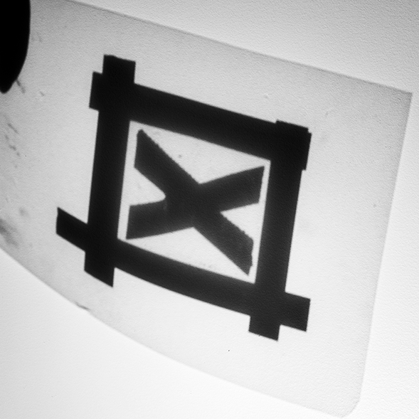
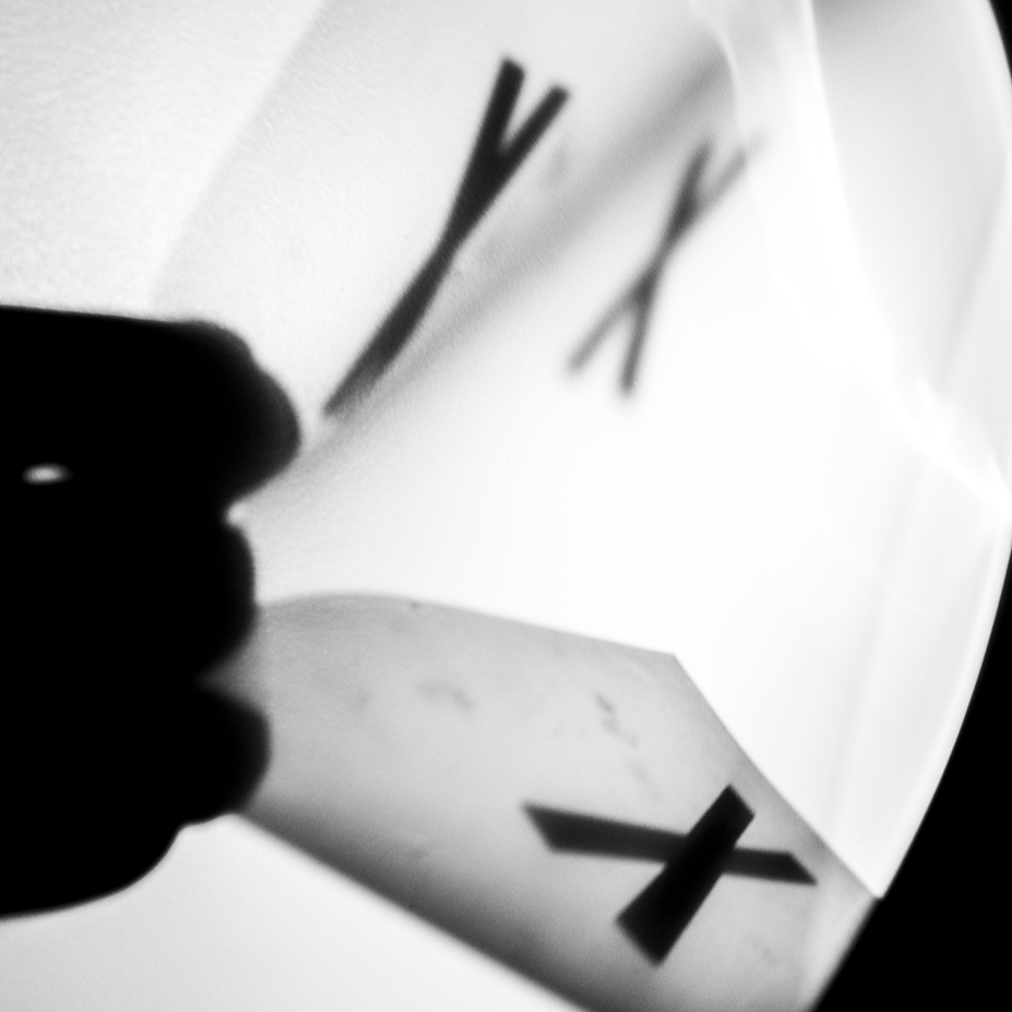
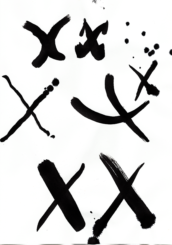
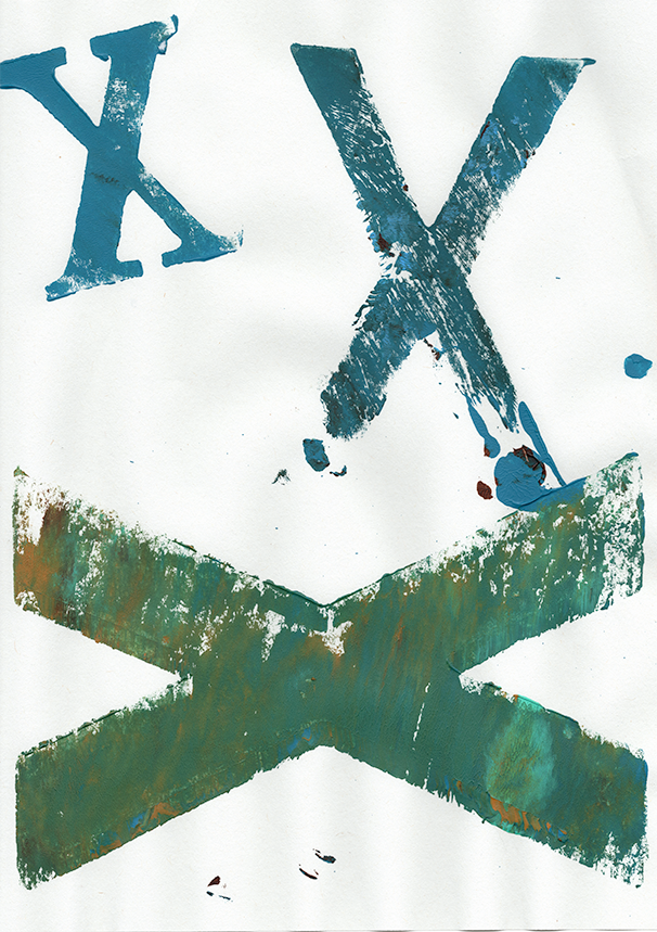
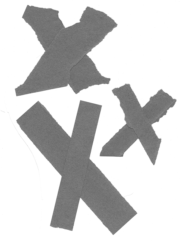
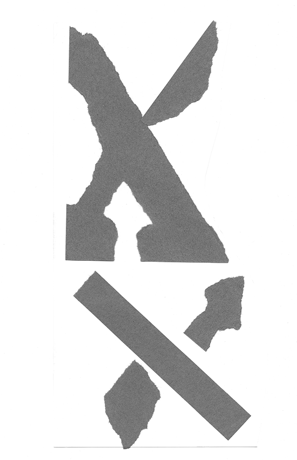
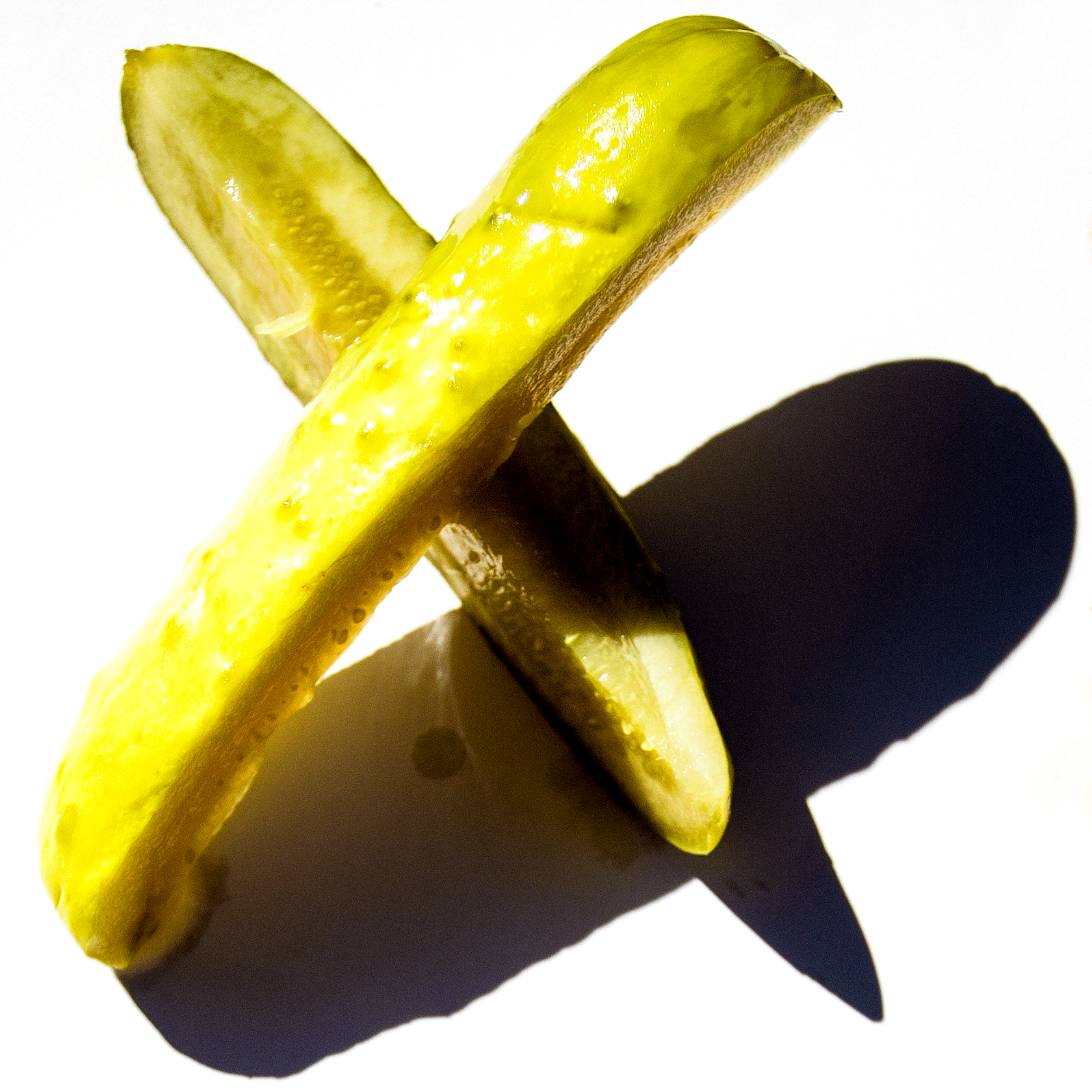
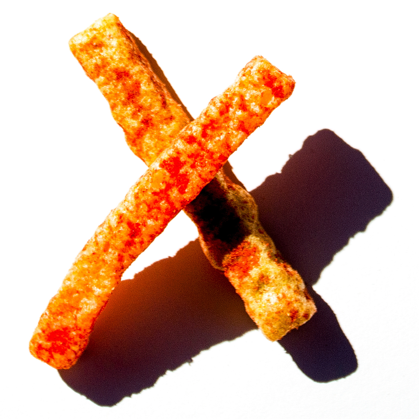
This project began by exploring the letter X. This included capturing X from transparencies, ink, stamping, cut paper, and food. Next, vectors of the letter were developed to test out the X.


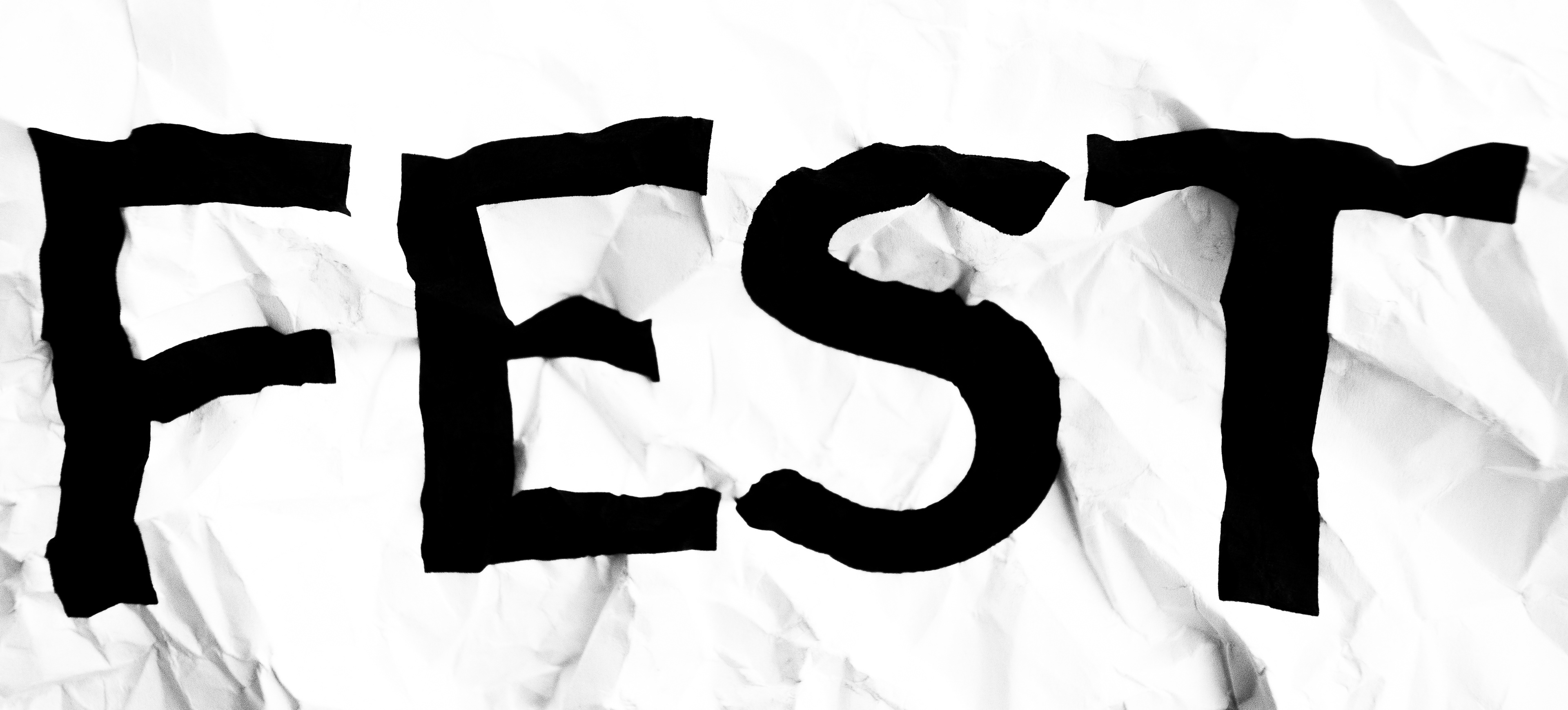
Having explored the letterform, the process turned to the logo. My desire for the “fest” part of the mark was to somehow mimic the crushing of metal closely associated with Magneto. After some early drafts and collaboration, it was clear that the “fest” section of the mark would also need to start practically, by printing out the words, crumpling the pages, and photographing the results.
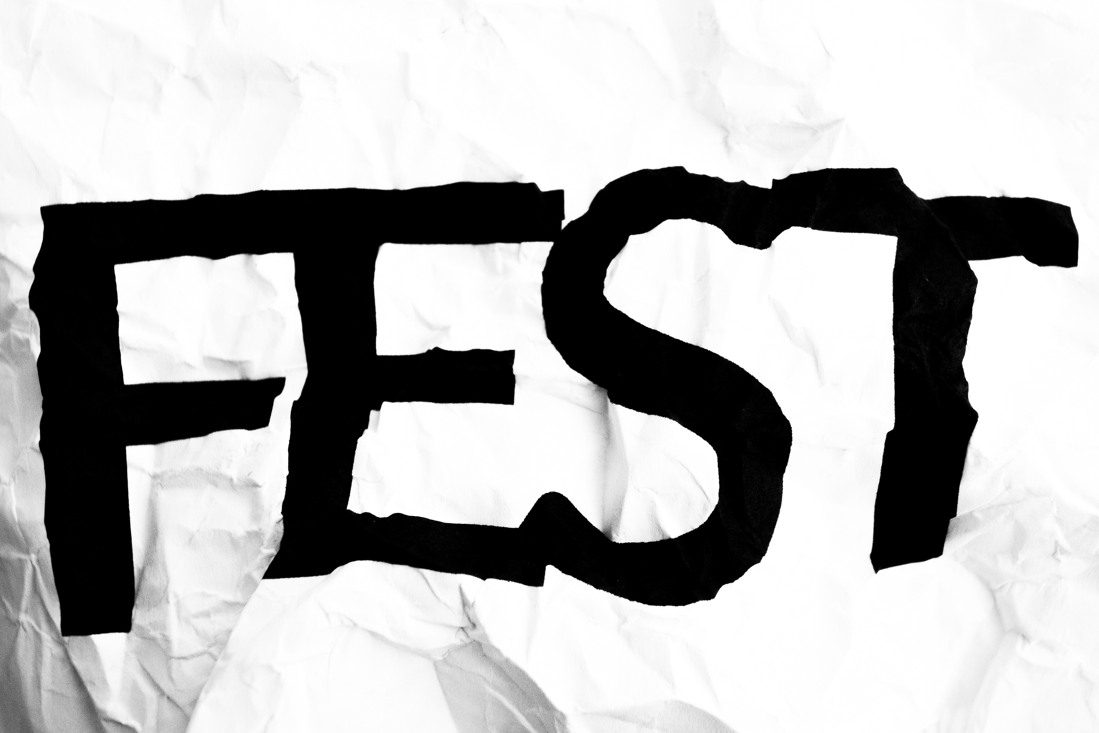

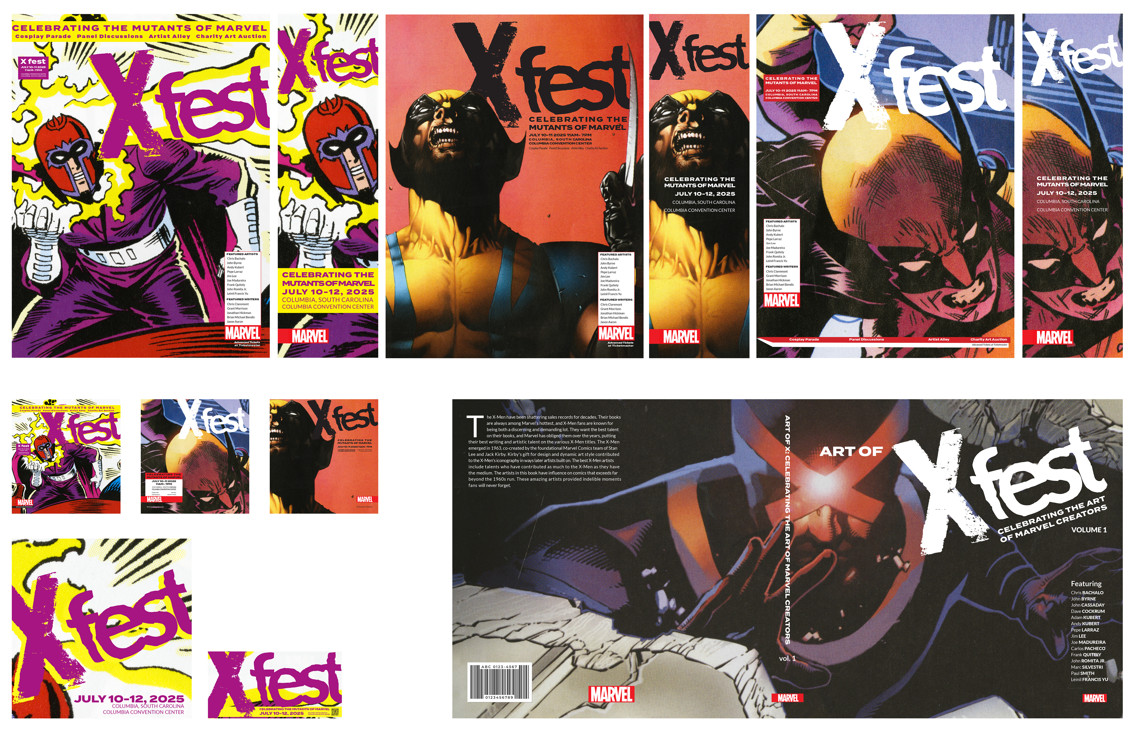
Having finally found the “fest” I liked, I completed the logo. From there, it was onto the poster when I decided to build the system around multiple eras of X-Men comics and try to have the design match the covers of the era from which the original art was taken. Creating cohesion in the design system through nods to the history of the comic.
Final
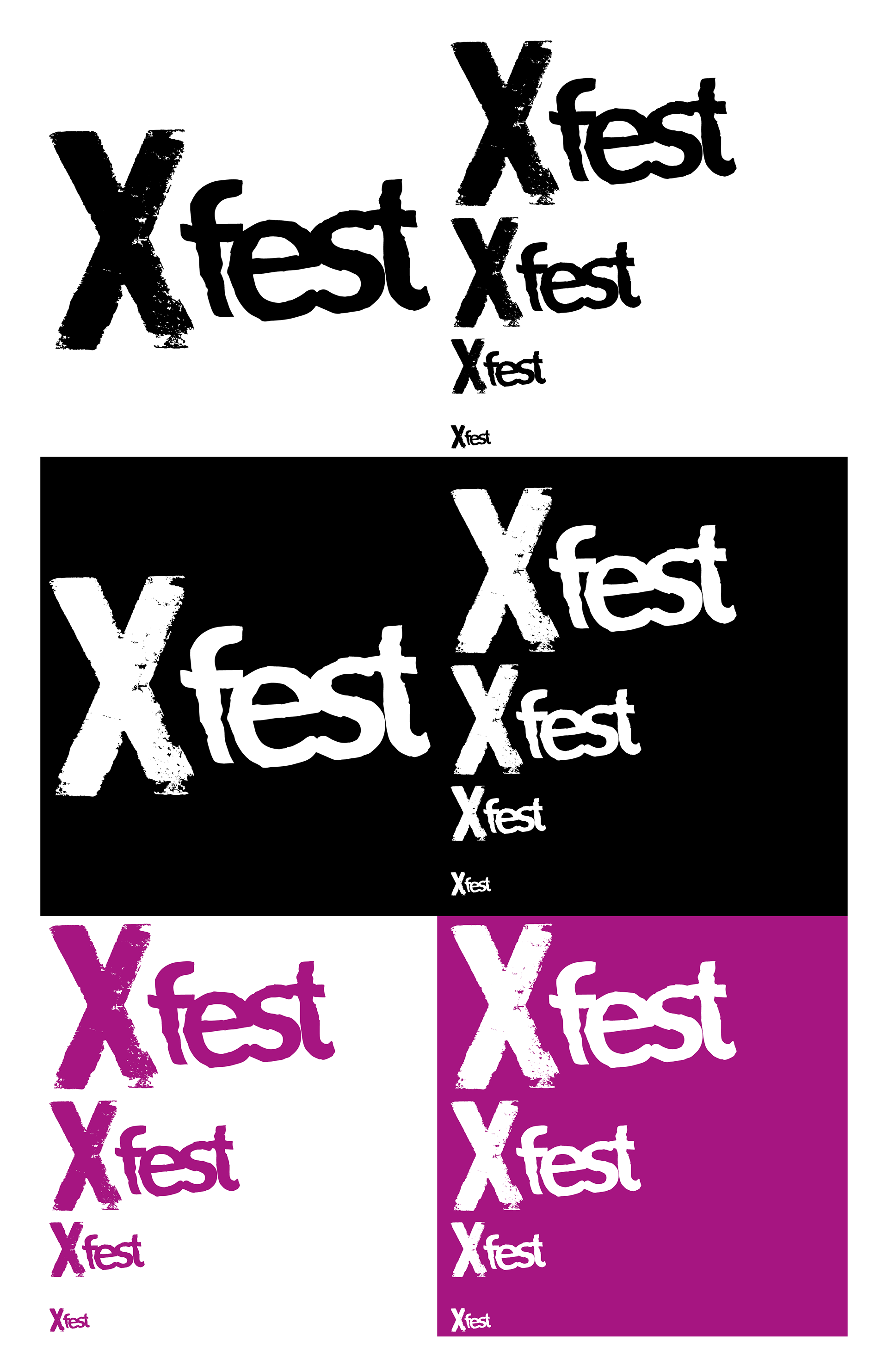
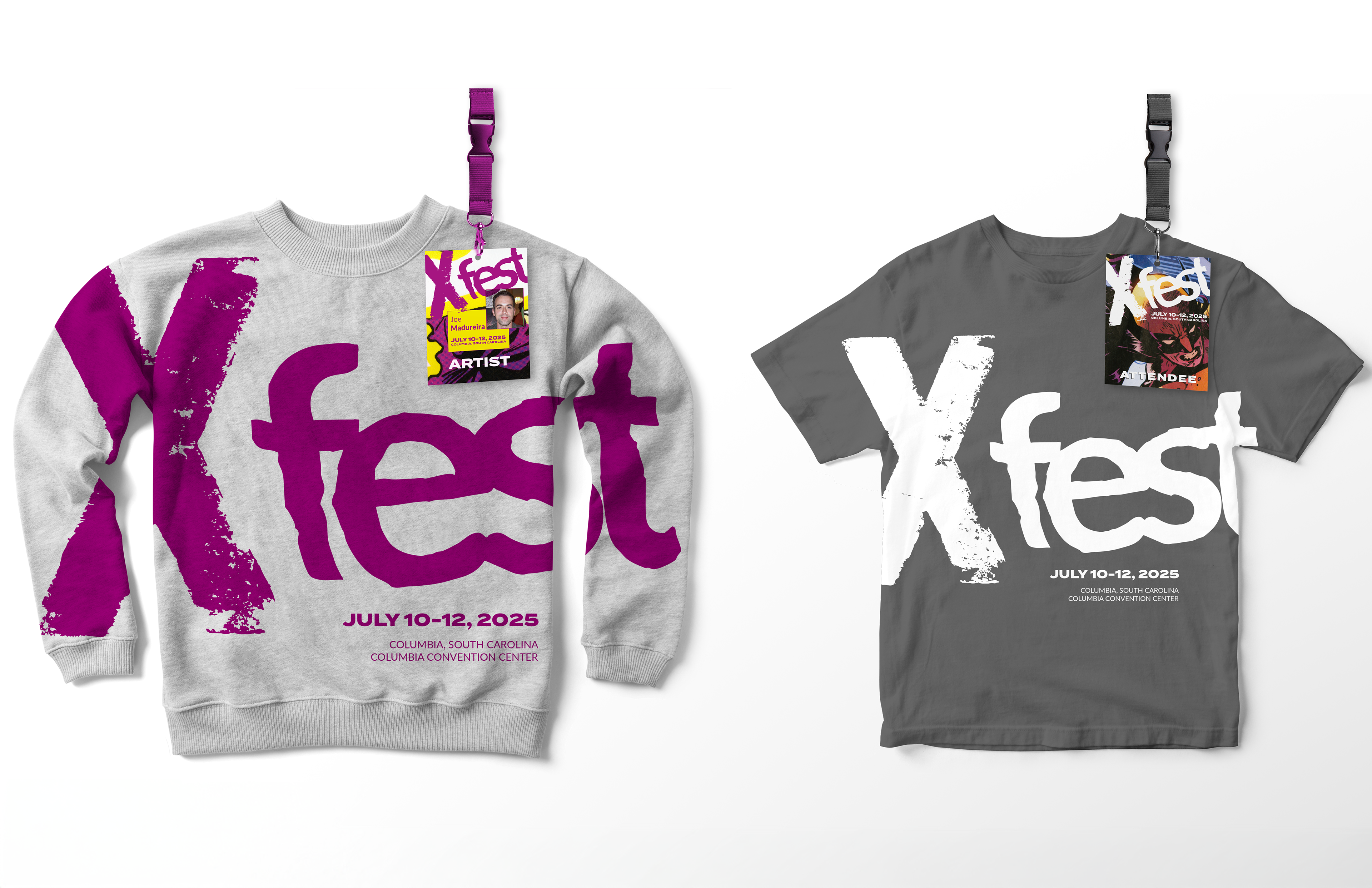
logos
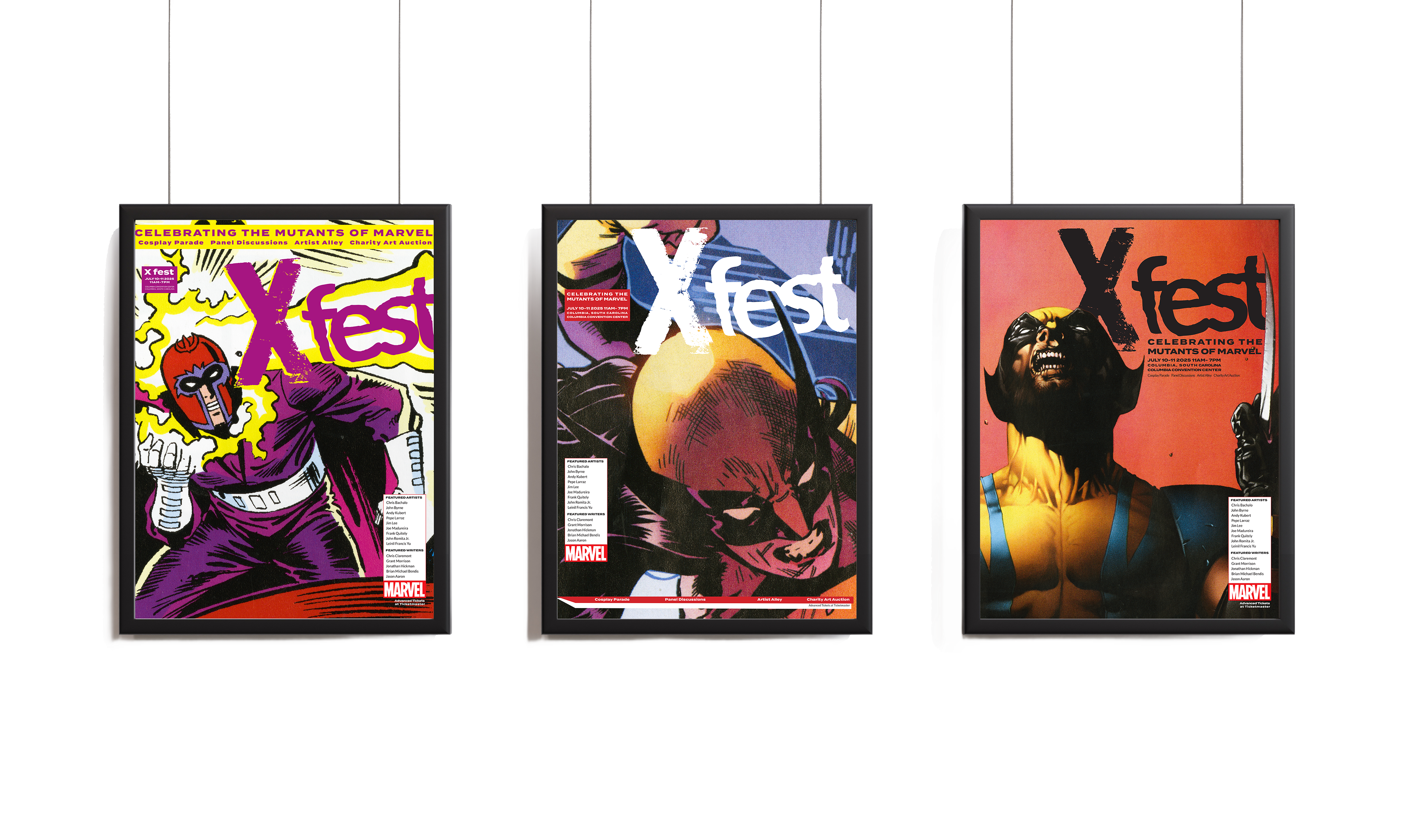
posters
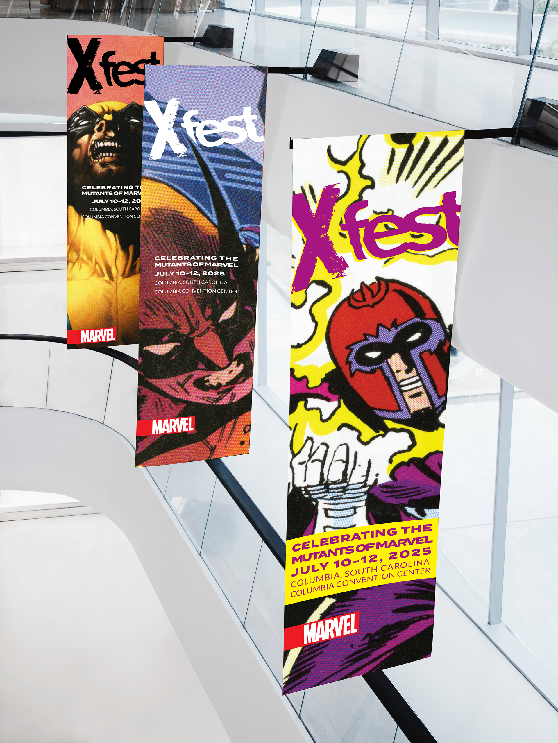
billboards
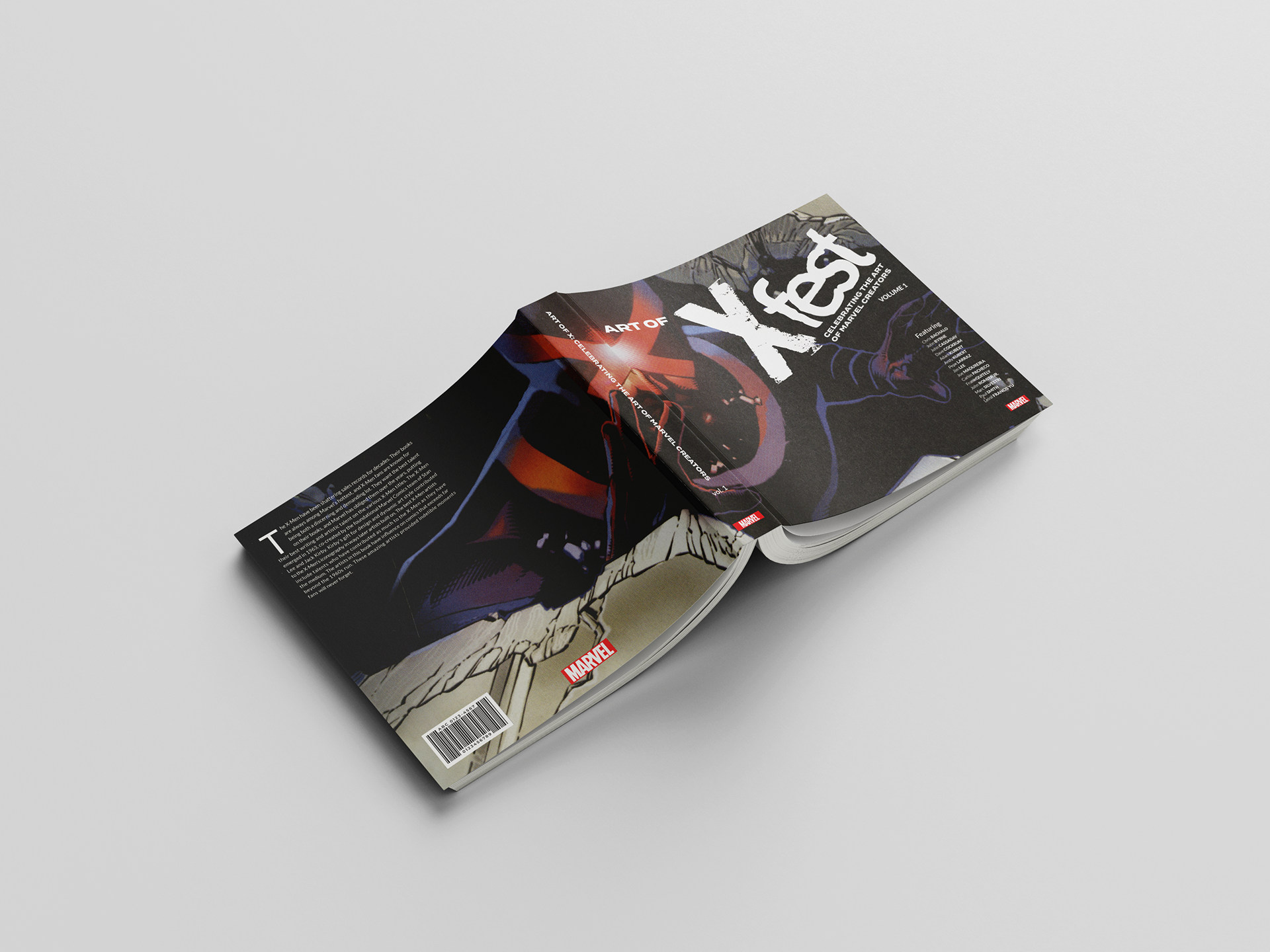
book cover